
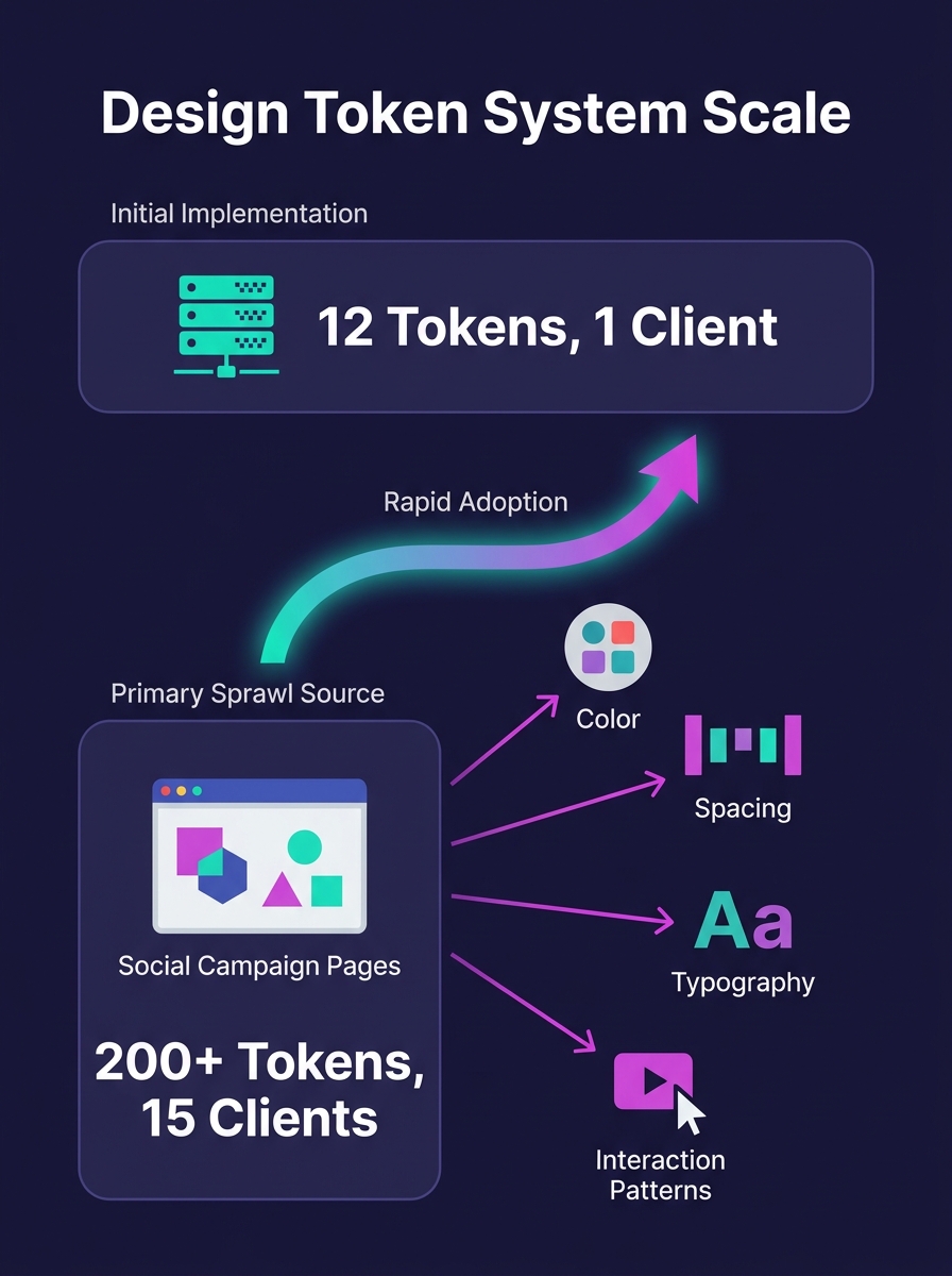
A white-label design system that starts with 12 design tokens will balloon past 200 by the time it serves 15 clients. The fastest-growing source of that token sprawl, across agencies we work with, is social media campaign pages: branded landing destinations, link-in-bio microsites, and ad-click pages that demand client-specific layouts, colors, and interaction patterns the original system was never built to handle.
TL;DR: Design system flexibility for social campaign pages breaks predictably around the 12-15 client mark, when token counts explode from a manageable dozen to 200+. The fix is structured governance: tiered token layers, component variants with locked interaction patterns, and strict override policies that keep campaign page production fast without fracturing your core system.
Why Social Campaign Pages Break Design Systems First
Social media campaigns create unique pressure on white-label design system architecture. Campaign landing pages ship on tighter timelines than standard site builds. A client running a Facebook ad campaign needs a branded landing page by Thursday, not next sprint. That urgency pushes developers to override existing components rather than extend them properly.
Valentina García Aiello wrote in the Design Systems Collective that successful white-label systems let "each customization mode evolve independently without disrupting the whole design ecosystem." The problem is that social campaign pages don't evolve independently. They accumulate. Each client's Instagram link-in-bio page adds 3-5 custom overrides. Each Facebook campaign landing page adds another 2-4. By client 15, you're managing 200+ tokens and nobody remembers which ones are shared versus client-specific.
Designers end up spending roughly 40% of their time debugging inherited CSS rather than building new features. That maps directly to margin erosion. When your web designers spend two days untangling override conflicts for a single campaign page, the economics of white-label work collapse.
The Token Sprawl Problem in Reusable Component Libraries
Reusable component libraries for WordPress work well when every client needs the same basic components with surface-level theming. Swap the primary color, update the font family, drop in a logo. Automated tooling handles those first three tokens reliably across 50+ sites, as we've covered in our guide to automating design system tokens at scale.
The trap opens when social media campaign requirements push past surface theming. Client A wants rounded buttons with a bounce animation for their TikTok landing page. Client B wants sharp corners and no motion for their LinkedIn campaign. Client C wants a gradient overlay on hero images that none of your base components support. Each request is reasonable in isolation. Together, they fracture the component library.
UXPin's analysis of white-label design states it directly: "too much flexibility introduces cost and complexity. Every theme variation must comply with WCAG accessibility standards, testing color contrast, keyboard navigation, and screen reader compatibility for each customization." When you're running 20 social campaign variants across 15 clients, that testing burden multiplies fast. Farcostudio's research reinforces the point: "certain component structures and layouts may not be scalable to all brands." The components that break first are always the ones closest to marketing. Hero sections, CTA buttons, testimonial cards, and pricing tables are the exact components social campaign pages depend on most.
Design System Versioning at Scale: Where Component Overrides Go Wrong
Component override management becomes the central technical challenge once you pass 10 active client brands. Nathan Curtis of EightShapes explained the core tension in his versioning guide: "Designers want the latest. Developers balance tradeoffs of new quality with scale and maintenance." Social campaign pages make that conversation harder because campaign timelines don't wait for version coordination.
Design system versioning at scale requires picking a strategy that matches your team's maturity. UXPin's comparison of versioning approaches found that component-level versioning offers flexibility for teams updating specific elements, while system-level versioning provides consistency and ensures coordinated rollouts for larger operations.
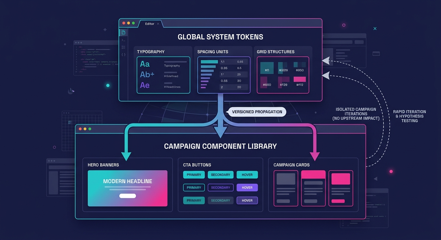
For agencies managing social campaign pages, a hybrid approach works better than either extreme. Version the core system (typography, spacing, grid) at the system level using SemVer. Version marketing-specific components (hero variants, CTA blocks, campaign cards) at the component level. This separation lets campaign pages iterate fast without triggering breaking changes across the full client portfolio. We've written a deeper breakdown of managing breaking changes across 50+ brands that covers the mechanics.
The Three-Layer Override Architecture
The fix for the customization trap is structured client-specific customization governance, applied through a three-layer override architecture:
Layer 1: Locked Core. Typography scale, spacing units, grid system, accessibility patterns. These never change per client. Every social campaign page inherits them. If a client request would modify this layer, the answer is no.
Layer 2: Brand Tokens. Primary and secondary colors, font families, logo placement, border radius, shadow depth. These swap per client through design tokens. Automated tooling handles the swap. This is where reusable component libraries for WordPress deliver their value, and where building component libraries that deploy across 100+ brands pays off.
Layer 3: Campaign Overrides. Hero layout variants, CTA animation styles, social proof card arrangements, page-specific background treatments. These exist as structured component variants, not freeform CSS overrides. Each variant is documented, tested for accessibility, and assigned to specific campaign types.
The critical distinction: Layer 3 overrides are predefined variants, not open-ended customization fields. When a client's social campaign needs a new hero layout, your team builds it as a named variant within the component library. It gets accessibility testing, responsive checks, and documentation before it ships. It does not get added as 47 lines of custom CSS in a WordPress customizer field.
Warning: Unstructured CSS overrides in campaign pages are the single fastest path to design system drift. One override per campaign page, across 15 clients running monthly campaigns, produces 180 unmanaged style mutations per year. If you're already seeing symptoms, our guide to [detecting design system drift before QA catches it](/blog/white-label-wordpress-design-system-drift) covers early warning signs.
Governance Without Bottlenecks
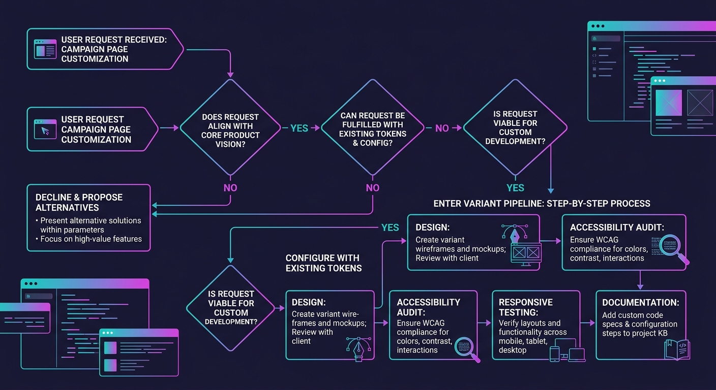
Client-specific customization governance sounds like bureaucracy. In practice, it's a decision tree your team runs in under 60 seconds per request. When a campaign page needs a visual treatment that doesn't exist in the component library, three questions determine the path:
- Does this treatment modify Layer 1 (core)? If yes, decline and propose an alternative using existing tokens.
- Can this treatment be achieved by combining existing Layer 2 tokens with a Layer 3 variant? If yes, configure and ship.
- Does this require a new Layer 3 variant? If yes, it enters the variant pipeline: design, accessibility audit, responsive testing, documentation, then deployment.
Bibliokit's governance research confirms that effective governance "creates a governance layer that supports scale without slowing down delivery." The 60-second decision tree keeps campaign timelines intact while preventing the override accumulation that causes systems to fracture.
Agencies that need to move fast on campaign pages should consider bringing on dedicated web development talent who understand the three-layer model. A developer who knows which layer a request belongs to will ship a campaign page in hours. A developer who doesn't will add custom CSS that costs you days of cleanup later.
Component Variants Over Custom Overrides
Component variants offer a scalable alternative to the "everything is customizable" approach that breaks white-label systems. Penpot's documentation explains that "component variants are structured versions of a component you can use to manage different options for your design pattern." A button component might carry 8 variants across size, style, and state. That's 8 testable, documented options, compared to an infinite surface area of custom CSS.
For social campaign pages specifically, we recommend maintaining variant libraries for five component categories: heroes (4-6 layout variants), CTAs (3-4 style variants), social proof blocks (3-5 arrangement variants), form sections (2-3 layout variants), and footer/compliance blocks (2 variants). That gives campaign builders 14-20 mix-and-match options, which covers roughly 90% of social campaign page designs without any custom overrides.
The design system customization trap is a governance gap that opens the moment social campaign deadlines override architectural discipline.
What Still Isn't Settled
Accessibility testing across variant combinations remains the biggest unresolved cost. A system with 20 variants and 15 brand token sets produces 300 potential combinations. Full WCAG compliance testing for every combination is prohibitively expensive for most agencies. The industry hasn't converged on an acceptable sampling strategy, and automated contrast checkers catch color issues but miss interaction and navigation problems entirely.
The tension between campaign speed and system integrity will persist, too. Social media platforms change ad formats, introduce new link card dimensions, and shift landing page best practices on cycles that don't align with design system release schedules. Agencies will keep facing requests that don't map cleanly to existing variants, and the governance overhead of handling those requests well costs real time.
What's clear is that the "make everything flexible" approach has a predictable failure point. Agencies that design their override architecture before they hit 10 clients will save themselves the painful migration that agencies at 20+ clients are working through right now. The token sprawl, the CSS conflicts, the accessibility gaps: these are all symptoms of flexibility without structure. And structure is always cheaper to add early than to retrofit late.