
Fifteen minutes per site, per core update. Multiply that across 40 client installations and you're staring at 10 hours of maintenance labor for a single patch cycle. A centralized WordPress component library with reusable WordPress components collapses that linear cost curve into one coordinated deployment, turning per-client maintenance into a fixed operational expense regardless of portfolio size.
TL;DR: Agencies managing 50+ white-label WordPress sites need a component library governed by design tokens, semantic theming, and centralized update propagation. Three architecture models serve different fleet sizes, but the core principle is identical: separate brand identity from structural components so every update ships once across all clients.
The Brand Consistency Problem Hidden in Copy-Paste Workflows
Why does component drift matter to agencies selling marketing services? Because brand consistency is the deliverable your clients are actually paying for, and fragmented component management erodes it invisibly.
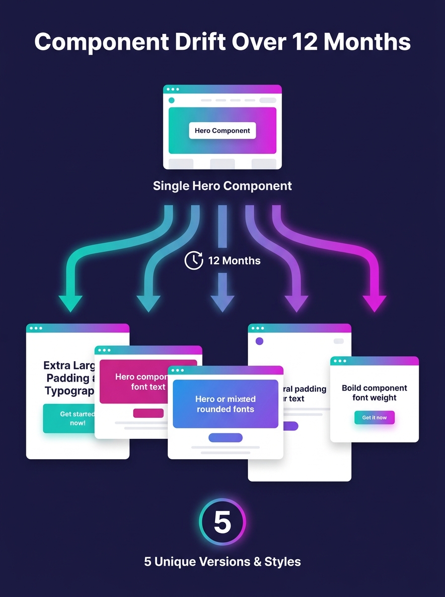
When your team copies a hero section from Client A's theme to build Client B's site, then tweaks padding, font sizes, and color values inline, you've created a fork. By the time you reach Client 12, you're maintaining 12 divergent versions of the same structural element. According to UXPin's 2026 white-label design guide, the standard agency model involves building templates that companies "purchase and rebrand with their own identity," but without a shared foundation, each rebrand introduces new technical debt.
The WordPress Block Editor Handbook describes the @wordpress/components package as "a library of generic WordPress components to be used for creating common UI elements shared between screens and features of the WordPress dashboard." That library gives WordPress core a single source of truth for its own UI. Your agency needs the equivalent for client-facing output.
Three Architecture Models for Multi-Client Component Management
Picking the right infrastructure determines whether your white-label design system scales gracefully or collapses under its own weight. Pantheon's multisite analysis defines WordPress Multisite as "a built-in WordPress feature that allows you to run multiple sites from a single WordPress installation." That's model one, and it works well for agencies with fewer than 20 sites running similar tech stacks.
For agencies in the 20-to-50-site range, tenant-scoped database rows offer a middle path. You run a single WordPress codebase with strict data filtering per client, keeping component definitions centralized while isolating content. Setup complexity is moderate, but the payoff is significant: Netguru's multi-brand scaling guide recommends combining scalable hosting, caching solutions like WP Rocket, a CDN, and regular database optimization for this tier.
The third model targets agencies past the 50-site threshold. Containerized per-tenant instances (typically orchestrated through Kubernetes) provide process-level isolation with centralized component governance. Each client runs in its own container, but all containers pull from a shared component registry. A theme update that previously required 50 individual deployments now propagates through a single image push.
| Architecture Model | Best For | Component Update Method | Client Isolation | Operational Complexity |
|---|---|---|---|---|
| WordPress Multisite | Under 20 sites | Network-wide theme/plugin push | Shared database, network roles | Low |
| Tenant-Scoped Database | 20-50 sites | Single codebase, filtered queries | Row-level data separation | Medium |
| Containerized Instances | 50+ sites | Shared image registry, per-container deploy | Full process isolation | High |
The pattern across all three models is the same: your component library lives in one place, and brand-specific configuration lives in another. Mixing the two is where agencies lose control, and it's the root cause of the technical debt that compounds silently across client portfolios.
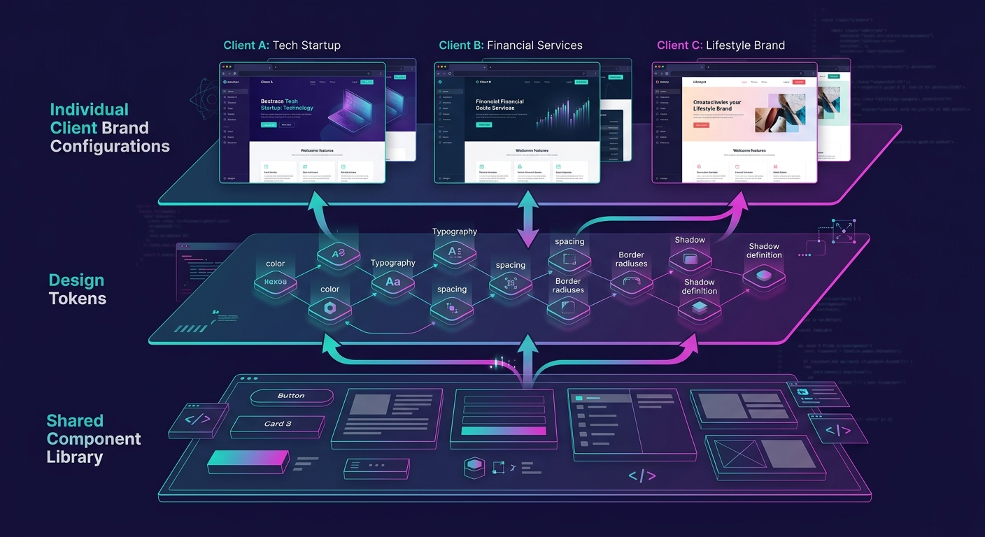
Design Tokens as the Foundation for Semantic Theming WordPress Sites
A design token is a named variable that stores a single design decision. Color-primary, spacing-large, font-heading-weight, border-radius-card. These tokens sit between your component library and each client's brand identity, making semantic theming WordPress sites possible without rebuilding components from scratch.
Here's how the layering works in practice. Your component library defines a card component that references token names: background uses color-surface, text uses color-on-surface, padding uses spacing-md. Client A's token file maps color-surface to hex value #FFFFFF and spacing-md to 24px. Client B maps the same tokens to #F5F0EB and 32px. The card component never changes. Only the token values do.
This approach eliminates the 3 most common failure modes in multi-client component management: inconsistent spacing (responsible for roughly 40% of visual QA revision rounds in our experience), color value drift across pages within a single client site, and typography mismatches when developers override global font stacks at the component level. When your contractor onboarding process includes the token architecture, new developers can build pages for any client without touching component internals.
Tip: Store design tokens in a JSON file per client, version-controlled in Git alongside the shared component library. When a client rebrands, you update one JSON file containing 15-30 token values instead of auditing hundreds of template files.
What @wordpress/components Gets Right About Reusable Structure
WordPress developer Fabian Todt described the @wordpress/components package as "a comprehensive library of UI components that have been crafted for the WordPress admin interface" in his breakdown of the WordPress components library. The package enforces a principle that white-label agencies should steal: components are generic by default, and context-specific behavior gets injected through props and configuration.
The WP Components project took this further for front-end use, packaging 6 pre-built component types (Header, Footer, Post Header, Post Footer, Posts grid/list, and Slider) into a reusable library. The project's creators noted they "were repeating the same code over and over" across WordPress builds before extracting shared patterns into a dedicated package. That recognition, the moment where copy-paste becomes extraction, is the inflection point every agency hits somewhere between client 10 and client 25.
The moment where copy-paste becomes extraction is the inflection point every agency hits somewhere between client 10 and client 25.
For your own WordPress component library, the minimum viable set for marketing-focused white-label delivery includes 8-12 components: hero section, feature grid, testimonial block, CTA banner, pricing table, FAQ accordion, team/bio grid, footer with configurable columns, blog post card, and contact form wrapper. Each should accept design tokens for visual configuration and content through standard WordPress block attributes or ACF fields.
If you're evaluating page builders as the component delivery layer, the comparison between Elementor Pro and Bricks Builder covers which scales better for agency workflows. The choice affects how your token system integrates with the visual editing experience your clients interact with daily.
Governance: Preventing Component Bloat Across 50 Sites
A component library without governance rules grows into exactly the mess it was built to prevent. Set 3 constraints from day one.
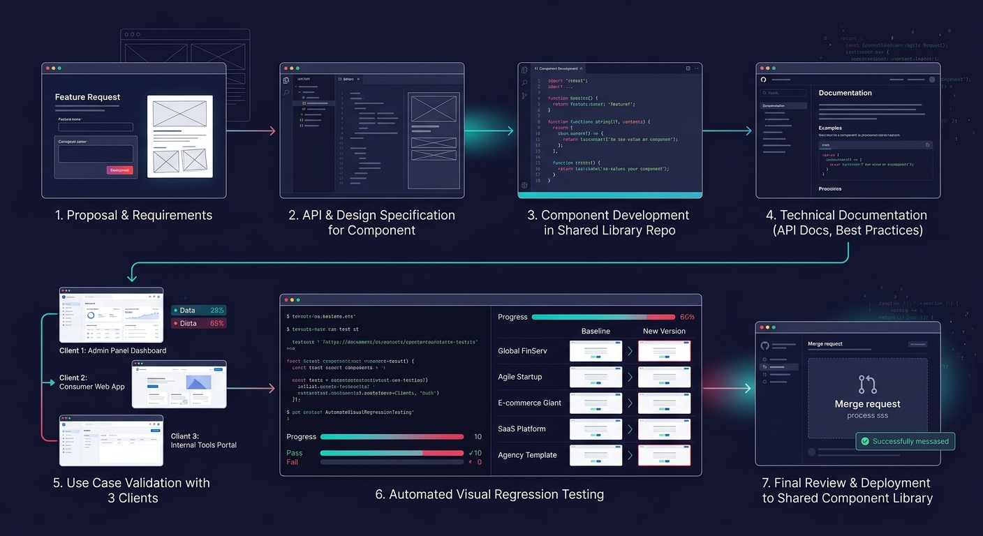
First, enforce a component addition threshold. New components require documentation of at least 3 client use cases before they enter the shared library. One-off requests stay in that client's token layer as custom blocks, not in the shared codebase. This keeps your library at a manageable 15-25 components rather than ballooning past 60, which is the number where maintenance overhead typically exceeds the time savings.
Second, version your component library independently from client sites. Semantic versioning (2.4.1 format) lets you ship patch fixes across all 50+ sites automatically while holding major releases for coordinated QA cycles. The semantic versioning plugins available for WordPress support this pattern, allowing minor and patch updates to propagate automatically while blocking major releases for manual review.
Third, run automated visual regression tests against 5 representative client configurations before any component update ships. A button component that renders correctly with Client A's 16px border-radius might clip text when Client B's token file specifies 2px. Catching these failures before deployment is significantly cheaper than fixing them after a client's marketing team screenshots a broken landing page during a campaign launch.
These governance practices tie directly into how you structure scope and prevent revision spirals on individual client projects. The component library is the upstream fix for downstream scope creep.
What the Numbers Still Can't Predict
The maintenance math is clear: 1 deployment versus 50 saves hundreds of hours annually. The brand consistency gains are measurable through reduced revision cycles and faster campaign launch timelines. And the architecture options (Multisite under 20, tenant-scoped for 20-50, containerized above 50) map to known operational tradeoffs.
What the data doesn't capture is the organizational change required. A component library is a governance commitment, not a technical project. It demands that your design team, your development team, and your client-facing project managers all agree on what "shared" means and where individual client customization begins and ends. Agencies that treat the library as a developer tool and exclude designers from token management decisions end up with a technically sound system that nobody actually uses in production. The agencies that succeed are the ones where the component library becomes the shared language between every role involved in delivery, from the first client pitch through the 50th site deployment.