
Figma's variable-driven token architecture lets agencies maintain a single component library that deploys across dozens of client brands without duplicating files. The approach replaces per-client design systems with a shared structure differentiated by swappable tokens for color, typography, and spacing, cutting multi-brand delivery timelines by as much as 87% in documented deployments.
The Token Architecture That Replaced File Duplication
Why does multi-client brand scaling break down in Figma? Because the most common approach, duplicating an entire design system file per brand and then manually modifying styles, creates an instant maintenance burden that compounds with every client you add. According to the Supernova State of Design Tokens 2024 report, 69.8% of design teams have now migrated to Figma Variables, abandoning static styles in favor of a hierarchical token structure that supports white-label deployment from a single source file. The old workflow of "duplicate this file, change it, and you've got a new design system" was fine for three brands. At fifteen brands it's a liability, and at fifty it's unsustainable.
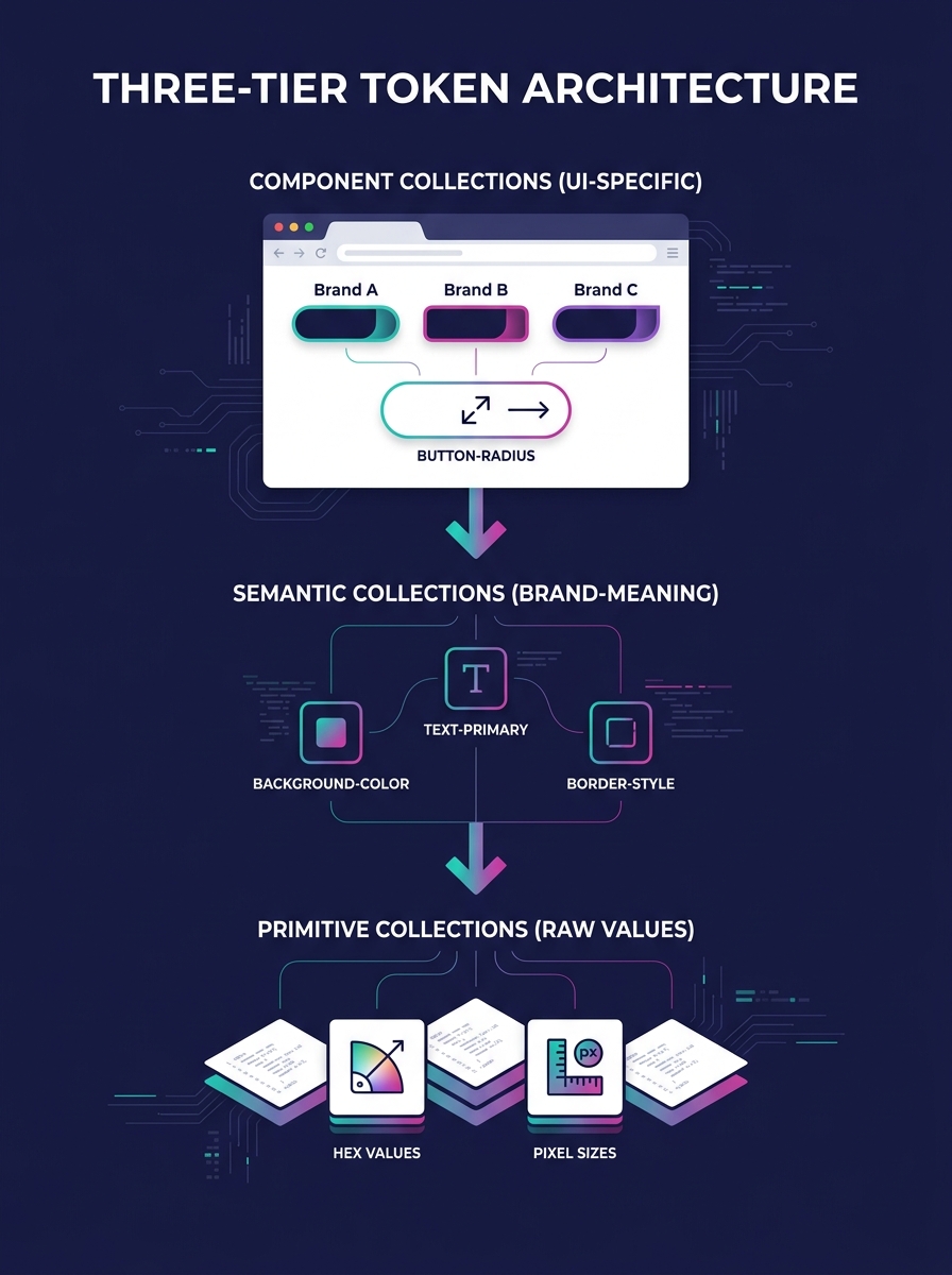
The architecture that works at scale follows what I'd call a three-tier token hierarchy. Primitive Collections hold raw values: hex codes like #1A73E8, pixel measurements like 16px, font family names like Inter. Semantic Collections assign meaning to those primitives in brand-specific ways, so a token named text-primary resolves to one hex for Client A and a completely different hex for Client B. Component Collections then map semantic tokens to specific UI elements, so button-radius pulls from the brand's semantic layer rather than hardcoding a pixel value. Swapping an entire brand identity requires changing only the semantic layer, and every component downstream updates automatically without anyone touching the individual parts.
Figma's Extended Collections feature makes this practical for agencies running 20, 40, or 60 client brands simultaneously. An agency publishes the core, unbranded design system as a shared library, and each client project extends it with a brand-specific variable set. The child file inherits structural updates (new components, layout changes, accessibility fixes) while preserving explicitly overridden values for that client's colors, type scale, and spacing. When the agency fixes a bug in the core button component, every client brand receives that fix on next sync. That's the difference between maintaining 50 separate design systems and maintaining one design system with 50 theme layers.
The structural logic here maps directly to how design tokens serve as the single source of truth for production code. Teams using Atomic Design principles find that building complex interfaces from smaller, modular parts scales naturally across multiple brands and contexts. And for agencies running WordPress portfolios, this compositional approach mirrors how a reusable component library works in production, where the design system and the code share identical structural logic. When those two systems drift apart, you get the kind of silent fracturing that compounds across a 50-client operation before anyone notices the damage.
Component Governance and the Versioning Decision
Figma component standardization fails when ownership is ambiguous. The questions that matter are specific: who approves a major change, how deprecations get communicated, and when older versions are retired. UXPin's research on component versioning identifies clear governance as the single most important factor for keeping versioning manageable across large teams, and their recommendation centers on defining these ownership boundaries before scaling the library rather than retroactively imposing them.
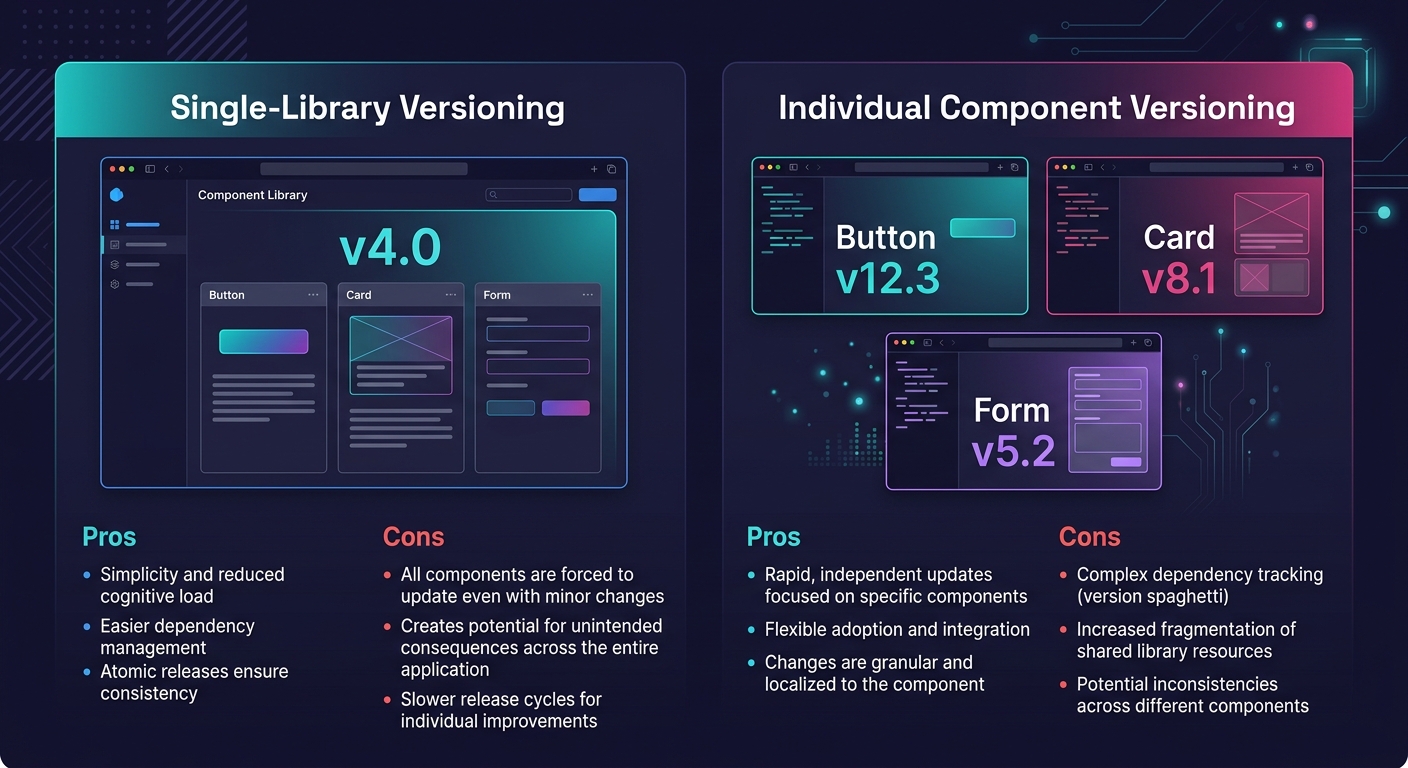
Brad Frost articulates the central versioning decision in practical terms: "You can version a design system's component library as a single package (e.g. Polaris v8.0), or you can version each component within the library as its own mini package (e.g. Atlaskit Badge v15.0.8)." For white-label agencies, single-library versioning tends to be the pragmatic choice because it's simpler to communicate "we're on v4 of the design system" than to track which of 50 individual component versions each client project uses. The tradeoff is that a breaking change to any single component forces a major version bump for the whole library, even if 48 of your 50 components didn't change. Agencies running large portfolios need to weigh this carefully, and the strategies for managing breaking changes across 50-plus client brands deserve their own conversation.
The difference between maintaining 50 separate design systems and maintaining one design system with 50 theme layers comes down to three things: token architecture, governance process, and the discipline to enforce both.
IBM's Carbon design system illustrates what mature governance looks like at the enterprise level. Carbon serves product teams, marketers, and developers across IBM's ecosystem as an open-source, modular system where contributors inside and outside the organization iterate and submit changes through structured review. For agencies, the lesson is that governance requires process rather than rigidity. A Slack channel where designers propose component changes, a weekly 15-minute review call, and a documented deprecation timeline (deprecated components removed two major versions after notice) cover 90% of what agencies need. If your graphic designers and your front-end developers aren't looking at the same component library version, your Figma standardization effort is producing beautiful files that generate broken production sites.
Closing the Handoff Gap Between Figma and Production
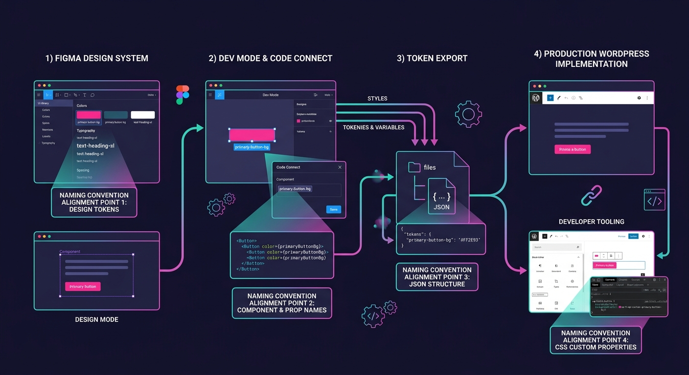
Component versioning automation and Figma standardization solve the design side of multi-client brand scaling. The design-to-development handoff is where agencies lose the time they saved. Figma's Dev Mode recovers an estimated 30% of developer time by letting developers access specs, inspect spacing, and extract token values without needing edit access to design files. Combined with Code Connect, which links Figma components directly to production code in frameworks like React, developers copy production-ready snippets instead of interpreting generic CSS from design specs. Figma estimates this integration delivers 135% ROI within a few years of adoption, a figure that assumes the design file itself is structured for developer consumption.
And that assumption is where most agencies stumble. Figma's own guide to developer handoff makes clear that the file itself is the spec: there are no separate redline documents or annotation layers. Layer naming conventions matter (prefixing with patterns like Icon/Home or Btn/Submit), separate pages for wireframes versus final designs versus exportable assets matter, and embedded notes explaining interaction states matter. Agencies that bolt on developer-friendly naming after the design work is done create rework cycles that erase the efficiency gains from having a shared component library. Your web designers and your front-end developers need to agree on naming conventions, token hierarchies, and export formats before the design work begins, not after it ships.
For agencies building on WordPress, the Figma-to-production pipeline has an additional requirement. Design tokens exported from Figma need to map cleanly to CSS custom properties in whatever WordPress builder or theme framework the client site uses. Whether that's Elementor's global styles, a custom Gutenberg block library, or a bespoke theme with its own token system, the mapping between Figma's variable names and production CSS variable names needs to be explicit and documented. The best results come from using identical token names in both systems, so color-text-primary in Figma maps one-to-one to the same custom property in production CSS. When those names diverge, every new designer or developer who joins the project introduces translation errors that accumulate silently across client sites.
Figma's AI tools now automate some of the tedious maintenance: layer renaming, visual search to catch duplicate or near-duplicate components before they proliferate, and suggestions for inconsistent spacing. These features reduce the manual burden of keeping a multi-client library clean. But they reinforce good structural decisions rather than replacing them. A tool that flags duplicate button variants is useful only if someone made the initial decision about which button variants should exist.
Where the Efficiency Promise Gets Complicated
The argument for white-label design systems in Figma is strong on paper: build once, theme many times, ship faster. The 87% delivery time reduction cited in documented multi-brand deployments is real, measured against the alternative of building each brand's design assets from scratch. And the tooling has genuinely improved with Extended Collections, variable-driven theming, Dev Mode, and Code Connect to the point where the technical barriers to multi-client deployment are lower than they've ever been.
The complication is on the client side. Every client who buys a website from your agency believes they're getting something custom-built for their brand. The design system approach means they're getting a themed instance of a shared component library, which is architecturally identical to how SaaS products, WordPress themes, and enterprise platforms like IBM's work. That's fine as long as the theming layer is rich enough to produce visually distinct results. When a client's brand requires a component that doesn't exist in the shared library (an unusual navigation pattern, a bespoke interactive widget, a layout that breaks the established grid), the agency faces a decision: build a one-off that lives outside the system, or extend the system to accommodate the new pattern. The first option is faster but creates maintenance debt that compounds across the portfolio. The second is slower but makes the system more capable for every future client who needs something similar.
There's also a staffing dimension worth acknowledging. A three-tier token architecture with semantic naming, governance processes, and component versioning automation requires designers who think in systems rather than screens. Finding and retaining that talent is its own challenge, separate from the tooling decisions. Agencies that invest in the architecture but staff it with designers who don't understand or maintain the token hierarchy end up with a design system that looks right in the Figma file and breaks down the moment a new client brand gets added. The system is only as durable as the team that tends it, and solving for that durability involves hiring, training, and retention problems that no Figma feature addresses.