
A white-label component library works by isolating visual identity into swappable token layers while keeping structural markup in a single shared codebase. The common mistake agencies make is duplicating entire themes per client, which creates 100 independent maintenance surfaces instead of one.
TL;DR: A properly architected white-label component library separates structure (HTML, block logic, layout) from skin (colors, fonts, spacing) using design tokens. One component codebase serves every client brand. WordPress component versioning and shared component governance keep the library from fracturing as client count grows past 50, 100, or 200 sites.
The Core Separation: Structure vs. Skin
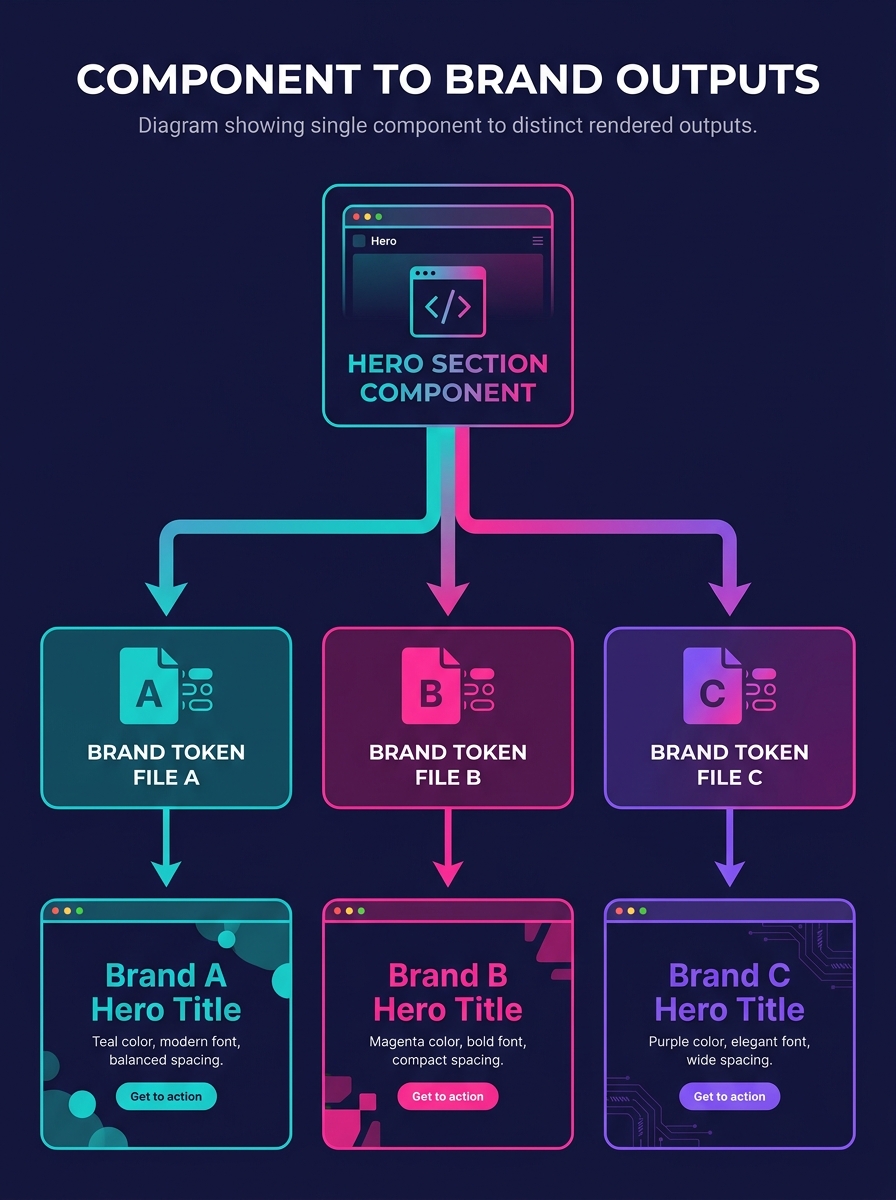
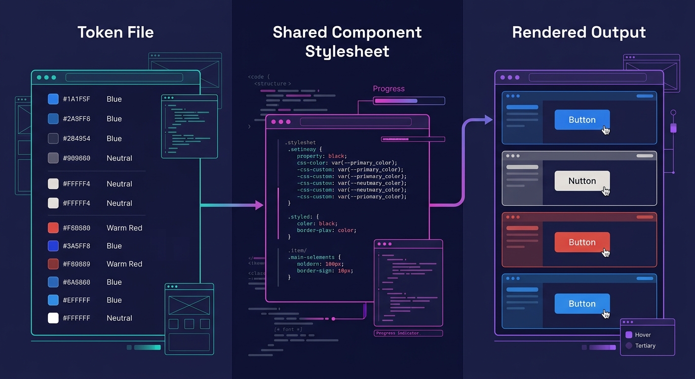
Every white-label component library relies on a single architectural principle: the markup that defines what a component does never changes between clients, while the visual properties that define how it looks are abstracted into variables. In WordPress terms, this means your custom Gutenberg blocks, your ACF-powered sections, and your template parts share identical PHP and JavaScript across every client site. The differences live entirely in a token layer, typically a set of CSS custom properties or a JSON configuration file that maps brand-specific values to generic variable names.
When an agency manages 30 clients with 30 forked child themes, each containing its own copy of a hero section block, a pricing table, and a testimonial carousel, that's 90 independent files to update when a layout bug surfaces. At 100 clients, it's 300 files. The UXPin best practices guide warns directly: "Poorly structured libraries can lead to technical debt, inconsistencies, and maintenance headaches." The structure-vs-skin split eliminates this multiplication entirely. One hero block. One pricing table. One testimonial carousel. Each pulls its brand identity from a per-site token file that's typically 40 to 80 lines of CSS custom properties.
Atomic Components as the Foundation
The mechanism starts at the smallest possible unit. Buttons, form inputs, headings, spacing values, and typographic scales form the atomic layer. These 15 to 25 base components generate every larger pattern in the library. A card component is a composition of a heading atom, a paragraph atom, an image atom, and a button atom arranged in a specific layout. A pricing table is 3 to 4 card components in a grid.
UXPin's scalable library guide recommends the approach explicitly: "Start with atomic components: build reusable buttons, inputs, and typography as your foundation. Set clear guidelines: use governance models to prevent duplication and maintain consistency." In practice, agencies building a white-label component library for WordPress register each atom as a block variation or an inner block within the WordPress Block Editor. The outer container block handles layout. The inner atoms handle content and styling.
This atomic approach yields specific efficiency gains. An agency with 20 atomic components and 12 composed patterns can typically cover 85% to 90% of page layouts across its entire client roster. Adding a new client brand requires writing a token file (1 to 2 hours of work) rather than building a new theme (40 to 80 hours). That's a 95% to 97% reduction in per-client setup time. For agencies already automating design tokens across 50+ sites, this atomic layer is what makes that automation possible.
The Token Layer in Practice
Design tokens are the variable set that makes one component library look like 100 different brands. A typical token file for a WordPress client brand includes 8 to 12 color values (primary, secondary, accent, background, surface, text, muted text, border, error, success, warning, info), 2 to 3 font families, a typographic scale with 6 to 8 size steps, a spacing scale with 5 to 7 increments, border radius values, shadow definitions, and transition timing functions. This adds up to roughly 50 to 70 discrete tokens per brand.
The tokens are loaded at the WordPress theme level, usually through a functions.php hook that enqueues a client-specific stylesheet containing only custom property declarations. The component library's shared stylesheet references these properties exclusively, never hard-coding a hex value or a pixel size. When site 47 needs its primary button color changed from #2563EB to #0D9488, the change touches exactly 1 line in 1 file. Zero component code is modified.
This is where design system maintenance becomes predictable instead of chaotic. A traditional multi-theme setup means tracking CSS specificity conflicts across 100 independent stylesheets, each accumulating overrides and hacks over months of client requests. A token-based setup means the component CSS is tested once, and per-client customization is constrained to a known set of 50 to 70 variables that can be validated with automated checks.
WordPress Component Versioning at Scale
A white-label component library serving 100+ sites needs version control that goes beyond "push to all sites simultaneously." WordPress component versioning operates on a release-channel model similar to browser release cycles: canary, beta, stable. The Vaadin design system team describes the principle behind this: "You should always archive old versions of the components in the interests of decreasing fragmentation. However, it's handy to save them somewhere for their documentation and the option to roll-back if a critical issue surfaces in the latest version."
For WordPress specifically, this translates to 3 practical layers. The component library lives in a private Git repository with semantic versioning (major.minor.patch). Each client site pins to a specific version through Composer or a custom update mechanism. When version 2.4.0 of the library ships a redesigned testimonial block, it rolls first to 5 to 10 internal test sites, then to a beta group of 15 to 20 low-risk client sites, then to the full fleet over a 2 to 4 week window.
As the version control guide from Barn2 describes it, version control helps developers "clone sections of code to work on before merging it back into the main codebase." For multi-tier agency scaling, this means each developer works on a feature branch, and the merge into the main library branch triggers automated testing against a representative sample of 5 to 8 client configurations before any site receives the update.
Agencies that have already tackled managing breaking changes across 50+ client brands will recognize this pattern. The release-channel model extends it past 100 sites by adding automated compatibility checks rather than manual QA for every client.
Warning: Skipping the staged rollout at 100+ sites creates catastrophic risk. A CSS regression in a shared component deployed simultaneously to 120 sites means 120 client complaints arriving within hours. Staged rollouts with automated visual regression testing (tools like Percy or BackstopJS comparing screenshots across 8 to 12 representative sites) catch roughly 90% of visual breaks before they reach client-facing environments.
Shared Component Governance
Why does the library fracture at all, if the architecture is sound? Because people add code. Governance determines who can modify the component library, how modifications are reviewed, and what happens when a client needs something the library doesn't offer. UX Planet's analysis of design system governance models identifies the federated model as the strongest fit for multi-team environments: "Teams can customize components to fit their needs while still adhering to a common design language and guidelines. Shared ownership means teams feel more invested in the design system, increasing adoption and engagement across the organization."
For a white-label agency, shared component governance typically follows a three-tier permission structure:
| Role | Can modify tokens | Can modify components | Can add components | Can deprecate components |
|---|---|---|---|---|
| Project Developer | Yes (client-specific only) | No | No | No |
| Library Maintainer | Yes (all) | Yes (with review) | Yes (with review) | No |
| Architecture Lead | Yes (all) | Yes | Yes | Yes |
This permission matrix prevents the most common source of fragmentation: a project developer modifying a shared component to satisfy one client's request, breaking the output for 99 others. The 2026 guide from ALM Corp on white-label WordPress development makes the standard explicit. Agencies should "establish explicit coding standards your white label partner must follow, including WordPress Coding Standards, specific frameworks or methodologies you prefer, required plugin libraries, prohibited approaches. Request code review opportunities during development, not just at project completion."
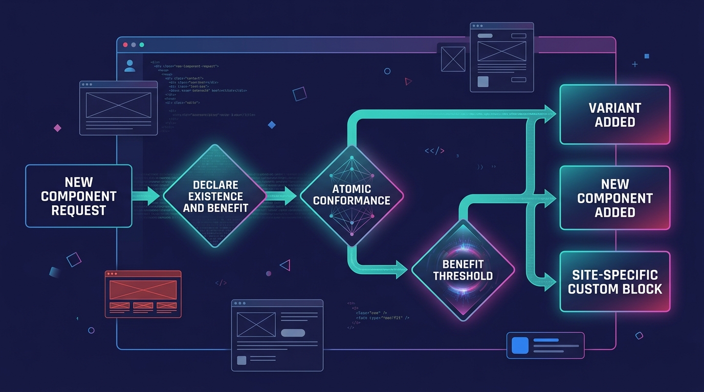
When a client genuinely needs a component that doesn't exist in the library, the governance process routes the request through a review that asks 3 questions. Can an existing component be extended with a new variant? Will at least 15% to 20% of clients (15 to 20 out of 100) benefit from this component? Does it conform to the atomic structure of the existing library? If the answer to the first question is yes, a variant gets added. If the second question clears, a new component enters the library. If neither, the client gets a site-specific custom block that lives outside the shared library entirely, documented as a one-off with a maintenance note.
Agencies dealing with design system drift across large portfolios find that this 3-question filter eliminates roughly 60% to 70% of one-off requests by revealing that an existing component variant already covers the need.
A white-label component library with 100 clients and no governance model becomes 100 slightly different component libraries within 6 months.
Where the Model Breaks
The structure-tokens-governance model handles visual branding well and layout variations reasonably. It starts to crack in 3 specific scenarios.
Divergent functionality requirements. When client 34 needs a pricing table with a toggle between monthly and annual billing, client 78 needs a pricing table with a comparison slider, and client 112 needs a pricing table with an embedded calculator, the single-component approach reaches its limit. The component either accumulates configuration flags until it becomes a 500-line block with 15 toggle attributes (a "god component"), or it forks into 3 separate blocks that share 70% of their code but diverge on the remaining 30%. Neither outcome is clean. The practical ceiling for functional variants within a single component sits around 4 to 6 before complexity becomes a maintenance liability.
Third-party plugin conflicts. A shared component library assumes consistent WordPress environments across all 100+ sites. When client sites run different combinations of page builders (Elementor on 40 sites, Gutenberg-native on 35, Oxygen on 25), the component library's block registration, style enqueueing, and JavaScript initialization face 3 distinct runtime environments. Token-level abstraction doesn't solve execution-context differences. Agencies past 50 sites typically standardize on a single page builder or build adapter layers for each supported builder, adding 20% to 30% to design system maintenance costs.
Client-side performance at scale. Loading 50 to 70 CSS custom properties per page has negligible performance impact. Loading a component library's full stylesheet (often 80KB to 150KB minified) when a given page uses only 4 of 25 available components wastes 60% to 80% of the transferred CSS. Tree-shaking component stylesheets per page requires build tooling that adds operational complexity, and WordPress's enqueue system doesn't natively support per-block CSS splitting in all configurations. Agencies running reusable component libraries at scale address this through conditional asset loading, but the setup cost runs 8 to 16 hours of build configuration plus ongoing maintenance of the dependency map.
The model works, and it works for 100+ brands with fewer developers than you'd expect (typically 2 to 3 library maintainers plus project developers handling token files). But it works within boundaries. Knowing where those boundaries sit, and building the governance to enforce them, is what separates a library that scales cleanly from one that collapses under its own ambition somewhere around site 60 or 70.