
Conversion--whether it’s getting people to sign up to your newsletter, availing of a free trial, downloading an ebook, buying a course--is a cornerstone of any business. And many have said that good conversion rates are within the range of 2-5%.
But WordStream looked into conversion rates across industries (ecommerce, legal, B2B, finance) which they further categorized into median, Top 25% and Top 10% conversion rates. They found out that the Top 10% were getting 3-5 times higher conversions than the average in their industry.
So if you want to be part of the Top 10%, what can you do? One solution is to get better at crafting high-converting landing pages.
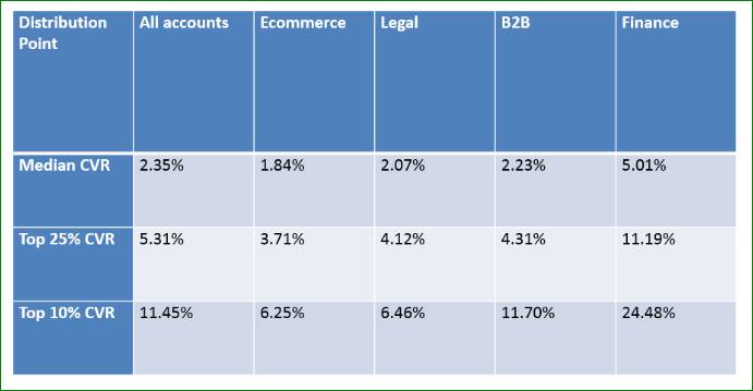
Source: WordStream, Conversion Rate by Industry
I. Landing Pages: What They Are and Why You Must Have Them
Instapage describes a landing page as a “standalone web page, disconnected from a website’s navigation, created for the sole purpose of convincing a visitor to act.”
Note that a landing page is not just any page where your visitors “land” when they click on an ad. Some businesses do not use landing pages for their paid campaigns, and instead direct visitors to the home and contact pages of their websites.
As accurately captured by Instapage, a landing page is a unique page that’s different from your website. Also, these are created with a specific goal, which may include:
• Capturing visitors’ information, such as their name, email address, company name & size, business type, etc.
• Convincing them to go to another page, such as a product offer.
• Selling a product or service.
Notice that landing pages are not just used to sell. They are also often used to grow an email list and generate or nurture leads. Landing pages are often crafted to support a specific campaign, such as paid search and social media advertising, and email marketing.
Businesses have been using landing pages for their lead generation and marketing efforts because it has been very effective in generating leads. For example, according to HubSpot, B2B and B2C companies who have more landing pages are also generating a lot more leads.
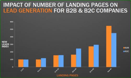
Source: HubSpot
This may be because having more landing pages gives you (1) more opportunities to capture your visitors’ information; and (2) opportunities to present different offers that are more applicable or helpful to specific buyer personas or segments.
But why not simply direct traffic to a page on your website?
One major reason is that your website is often very general and contains a lot of details and links. So when visitors land on your site after clicking an ad, they may get distracted with all the navigable buttons. Instead of directly downloading a report or starting a free trial, they may decide to click on your testimonials, visit your social media pages, briefly explore your site… then leave.
If you’ve spent quite a sum for paid search, you want to increase your chances of converting every visitor who clicks on your ad. So instead of directing them to a “noisy” site, you want them to laser-focus on your goal. For example:
• If you want them to type in their contact information and download your report, then create a landing page that asks for their personal or work details before they can access the report.
• If you are offering a discount on a product, you want to drive traffic to a landing page that explains the benefits of the product, its original and discounted prices, and then a “buy now” button.
By focusing your visitors’ attention and narrowing their navigation options, you increase your chances of a conversion instead of confusing them with too many possible next steps.
II. Can You Have a Landing Page Without a Website?
The short answer is Yes. Since landing pages are standalone pages, you can create one even if you don’t have a full-blown website.
There are several apps that allow you to easily create a landing page, such as:
• Instapage, which lets you create mobile-friendly pages and collaborate with your team in real-time.
• Unbounce, which is great for the design-savvy creators. Aside from customizing graphics and texts, you can also A/B test versions of your landing page.
• MailChimp Landing Pages, which lets you build pages for email campaigns. It also has payment features to let you sell products even if you don’t have an ecommerce store.
• Leadpages, which is perfect for small businesses looking to advertise and sell their products or book clients. They also offer mobile-optimized designs and A/B testing, GDPR-compliant forms, email trigger links, and opt-in texts.
• Google Sites, which lets you create landing pages with a form, and track your page performance using Google Analytics.
Using landing pages even without a website has several advantages, some of which are:
• It saves you time. If you are running a startup and your lean team can’t create a new website yet, build landing pages instead. With the apps above, you and your team can test or launch your standalone page within minutes, even if everyone has no technical background.
• Start converting visitors right away. You don’t have to wait to have the perfect website to start building your email list or closing sales. You can do both even while your website is still under construction, or even if you don’t plan on building one anytime soon. And because you can have an unlimited number of landing pages, you can have plenty of opportunities to tailor these to your different buyer personas.
• Help your leads focus on one action. Because your visitors will only see one page with very little navigation options, they are more likely to focus on your message and the action you hope they will take. Having several navigation buttons (such as in your website) and pages usually distract your visitors. Instead of clicking “Download Now,” they may end up browsing your site, and forget to enter their contact details. That’s another lost lead for you.
III. What Is a Good Landing Page?
There are so many ways to craft and design a landing page, but the most effective ones have several elements in common.
1. Punchy Main Headline and Subheading
Your main headline and subheading are the first things visitors see when they reach your landing page. Plus, those who read your headlines are 90% more likely to read your call-to-action (CTA) too. So your headlines need to be powerful enough to make them stay on your page and read through your offer.
Aside from being attention-grabbing, your main headline must also educate readers about your product or services in as few words as possible. Keep your word count within 20, or better yet, 10 or less.
Then, leverage your subheading to provide a bit more information and convince them to stay on your page and learn more about your offer.
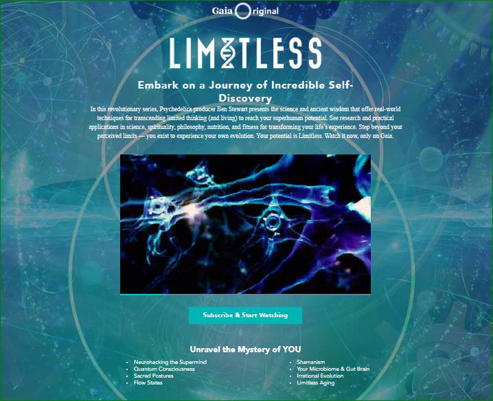
Source: Gaia
2. Attention-Grabbing Images or Videos That Show Context of Use
Choosing high-quality graphics is not enough. Take note that our brains process visual data so much faster than text, and you can leverage this by using images and videos that convey a lot about your product. You can create one that shows a product’s features, benefits, or how easily clients can use it.

Source: Hickies
3. Standout Selling Proposition
Use your landing page to zero in on features that set you apart from your competition. Then combine graphics and texts to clearly highlight key features. If there are multiple features you want to highlight in one landing page, break down your page into sections, and highlight one feature or image per block. This will make your page look more organized and your message easier to digest, especially for visitors who are hearing about your message for the first time.
Here’s a section of GetResponse’s page, highlighting their countdown timer feature for landing pages. See how the text was written to:
• show how these timers can support the client’s goal (i.e., more conversions), and
• where they can use these (i.e., sales offer, webinar invites, event registration pages).
Then they matched this with an image showing:
• their app.
• where clients will find the timer button.
• what it looks like (i.e., it can feature days, hours, down to seconds).
• AND the graphics also communicates how easily clients can add the countdown timer.
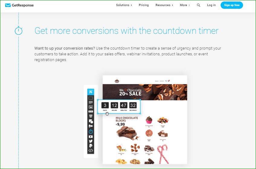
Source: GetResponse
4. Emotionally-Stirring Points ( Pain and Pleasure)
To be effective, your landing pages need to pull at your visitors’ heartstrings. You can achieve this in two ways: focus on how your product solves their pain or problems, or how this can add to their joy or fulfill a desire.
If you focus on pain, start by naming the problem your visitors are likely going through. Show how your product or service relieves this pain. In the testimonials, include clients who mentioned how you have helped them solve their problems.
Consider these featured testimonials in Elementor’s landing page. They included a client tweeting how Elementor made “WordPress design less frustrating” and another who felt he had wasted resources on other page builders, and was happy he finally found Elementor.
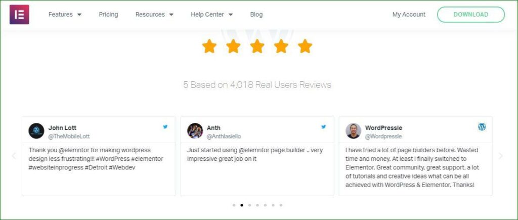
Source: Elementor
If you focus on pleasure, show how your product makes life a lot more fun or easier for your clients. Consider this portion of AlgaeCal’s long-form landing page. They sell a nutritional supplement catering to older individuals. While their product deals with a painful problem (bone loss), the landing page was crafted to focus on giving clients hope and a better quality of life even in their twilight years.
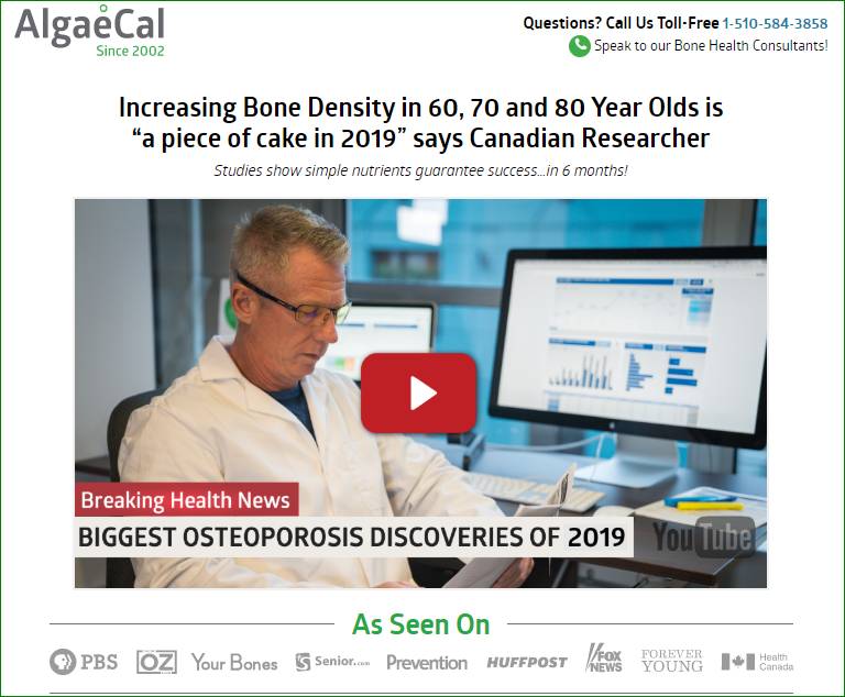
Source: AlgaeCal
5. Social Proof and Customer Reviews
Showing visitors accolades, expert reviews, and testimonials will help convince them that your offer is effective, your brand is trustworthy, and you will deliver what you promise.
There are many ways to add social proof on your landing page. You can:
• Indicate how many people have downloaded or signed up for your service;
• Insert customer reviews that include their name, photo, and company; or
• Awards you’ve received or reviews from respected institutions
Here’s an example from SimpliSafe, showing reviews from known sources.
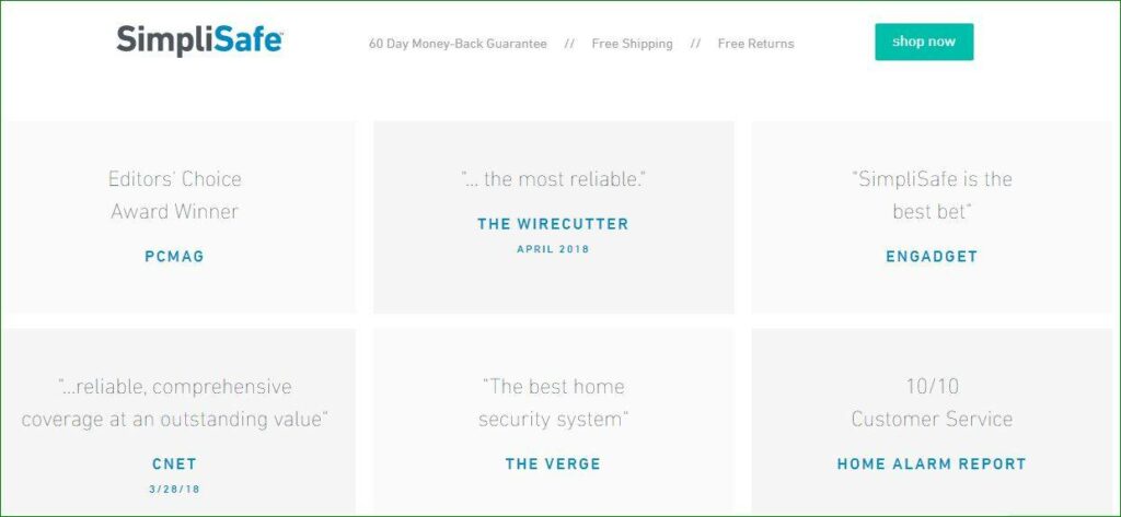
Source: SimpliSafe
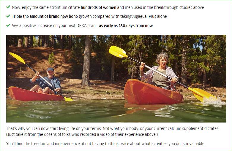
Here’s how AlgaeCal added social proof by inserting a short video featuring doctors and clients.

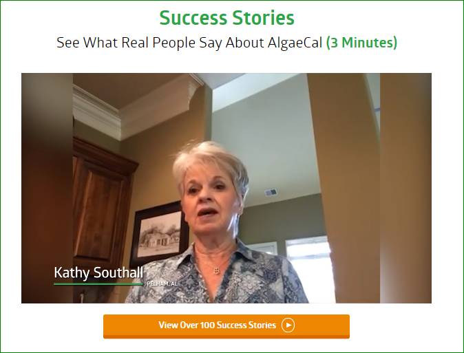
Source: AlgaeCal
6. Methods of Contact
Including multiple contact details helps establish your company as trustworthy. You want visitors to know you actually have a physical office, for instance. If they hesitate filling out your form but would like to know more about your offer, there’s a number they can call or an email address to send a query to.
If you wish, you can also include a live chat window so visitors have a first-hand experience of your customer service. If they have reservations about signing up, these can also be quickly addressed via live chat.
7. Guarantees
Guarantees help in minimizing your visitors’ fears or reservations for signing up or testing a product. You can offer guarantees by:
• Indicating money-back offers.
• Mentioning 100% spam-free emails.
• Emphasizing “FREE” offers or risk-free trials similar to GreenRope’s offer below.
Be sure your visitors can easily see your guarantees. You can place it near the call-to-action button, above or below a sign-up form, and repeat this several times in your landing page.
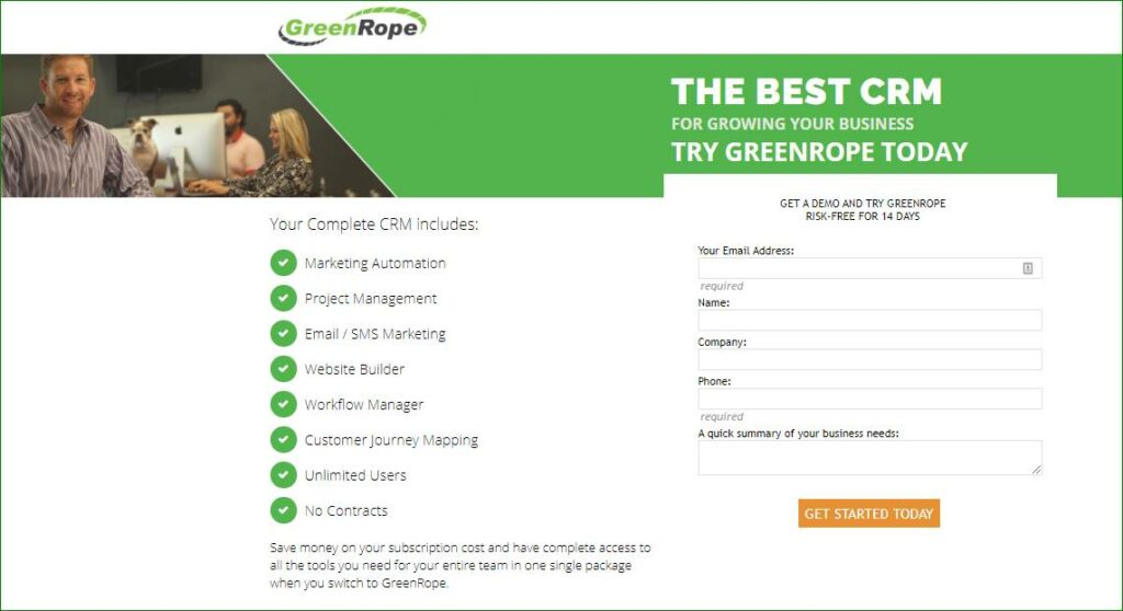
Source: GreenRope
8. Powerful Closing and Call to Action
Your closing has to be convincing and quickly sum up the benefits you offer. It’s your last chance to get a visitor to say “Yes” and convert.
Partner this up with a very visible and persuasive CTA. Aside from using convincing text, make the design stand out by using bigger fonts and contrasting colors.
Notice this CTA at the bottom of Sounds True’s landing page. Apart from crafting a powerful closing (by mentioning “life-changing” and “less than 15-minutes,” they used contrasting colors for the CTA button. The CTA also clearly mentioned the offer (i.e., first lesson) and a guarantee (“free”).
III. How You Can Create a Landing Page That Converts
• Make Navigation Easy and Simple
There are many ways to do this. One is by making sure that the most important or catchy details appear at the top of the landing page, which is also the first thing visitors see.
Another is by keeping texts and images simple and clean. A third option is to limit the buttons to your CTAs. This way, your visitors are not tempted to explore a bit, leave the landing page, and forget about your offer.
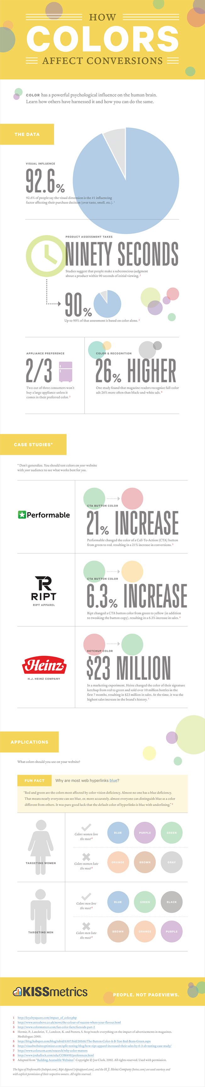
• Use Color Psychology
Brands and marketers have been leveraging colors to influence customers’ perceptions and opinions. You, too, can use color psychology to increase your conversions.
The dominant colors you choose for your landing pages or your CTAs will vary depending on your target buyers’ gender and also how you want to present your company. For example:
• If your target clients are women, go for blue, purple or green. For men, choose blue, green, and black.
• To convey trustworthiness, choose blue. Note how Progressive, an insurance company, used different shades of blue in their landing page.
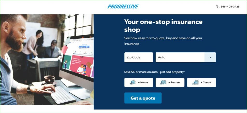
Source: Progressive
• For CTAs, bright primary and secondary colors, i.e., red, green, orange, yellow, are generating the highest conversions.
Changing the colors of your CTA button may impact your conversion. This is definitely one aspect you can A/B test when you create your landing pages. Find out which colors prompt your target audience to act.
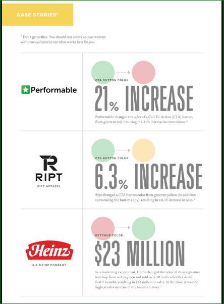
Source: neilpatel.com
• Make Your Copy Irresistible and Action-Oriented
Capture your visitors’ attention by creating copy that is short but powerful. Your copy must succinctly convey the benefits of your product or service and what problems or pain points it will solve.
• Use Bullet Points and Numbered Lists
Bullet points and numbered lists will make your landing page easier to read and digest. It will also give your page a clean look.
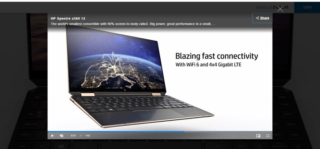
• Incorporate a Sales Pitch Video
Adding a video on your landing pages can boost your conversions by 86%. The videos you put in your landing page can have different contents. It can:
• Discuss your product’s benefits
• Give visitors a glimpse of how to use your product
• Highlight unique product features
• Contain client testimonials, which will boost social proof
• Interviews with experts attesting to the effectiveness of your product/service
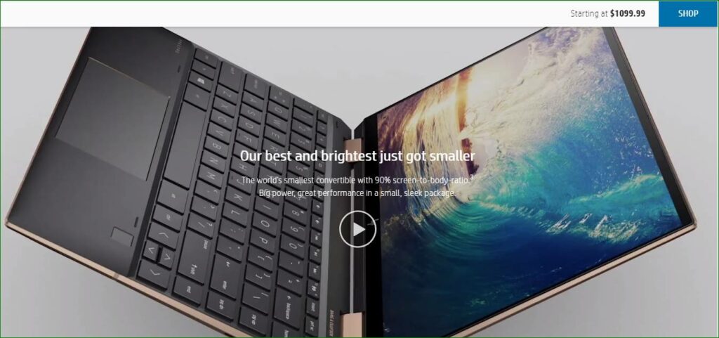
For example, a portion of HP’s page includes a video of their product. Clicking on the arrow opens up a smaller window, with a video highlighting the product’s features. Notice that the video even has a “Share” button on the upper right. It then gives you several platforms to choose how you want to share the video. This leads us to the next tip for high-converting landing pages.
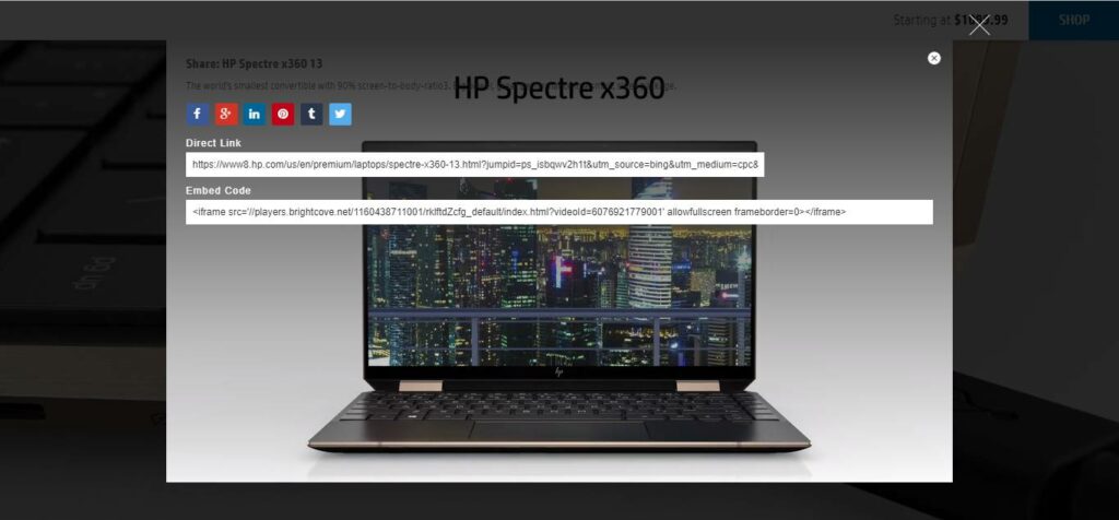
• Don’t Forget Your Social Share Buttons
Including social media links in your landing page makes it easy for your visitors to share your link to their own contacts. This, then, generates more visitors for you.
• Add Trust Symbols
Trust symbols can include awards or the logos of your well-known partners, clients, or service providers. Adding their logo, or even a testimonial and photo of one of their officers, can show visitors that your company is legitimate, established, and safe.
UpNest, for instance, provided the logos of brands they work with. These are respected brands in their own right, thus helping increase UpNest’s credibility.
Source: UpNest
• Consider Typography Elements Carefully
Typography is the “visual component of the written word.” It is often taken for granted, but it can deeply impact viewers and readers. The typeface you choose doesn’t just determine readability. It can also elicit emotions.
Keeping your typography consistent allows you to establish a brand identity. It also helps your readers focus on your landing page’s content, instead of getting distracted by too many design elements.
The sizes or hierarchy of your text matters too. Huge fonts grab readers’ attention and draw them in. When designing your CTA, use a bigger font size to signal to your reader that it is important, and to keep your CTA from getting lost amidst other texts.
• Optimize Opt-In Form
To further encourage your visitors to opt in, use the following techniques:
• Add a compelling headline above your form.
• Include a succinct description explaining the benefits or what they will get in exchange for their information. You can also mention their pain points.
• If your offer has a paid value or regular price, display the original value and then the discounted price.
• If you are offering a free ebook or report, display an image of the cover.
• Make your CTAs very noticeable by using contrasting colors. Experiment with fonts and colors, until you determine which one generates the highest conversions.
• Get creative with CTA copy.
• Below the form, guarantee that they will not receive spam emails. Also include a privacy policy if you are using Facebook ads.
• Also consider adding social proof or testimonials near or beside the opt-in form.
• Consider Interactive Landing Pages
Creating opportunities for your visitors to engage with your landing page allows them a brief experience of your brand. Interactive landing pages also encourages visitors to stay longer on your landing page, which can help boost your rankings.
You can make your landing page more fun and interactive by including:
• Quizzes
• Interactive images that allow you to zoom in any area or part of the photo
• Animations
Going back to HP’s page, visitors can actually choose from among three laptop colors. This powerful feature helps them visualize the product and choose a color they want, which can fuel the desire to purchase it too.

Source: HP
Here’s another interactive page designed by Digitaland for Lacoste. It starts by asking visitors if the target recipient of the gift is a “Him” or “Her” then proceeds to the next questions.
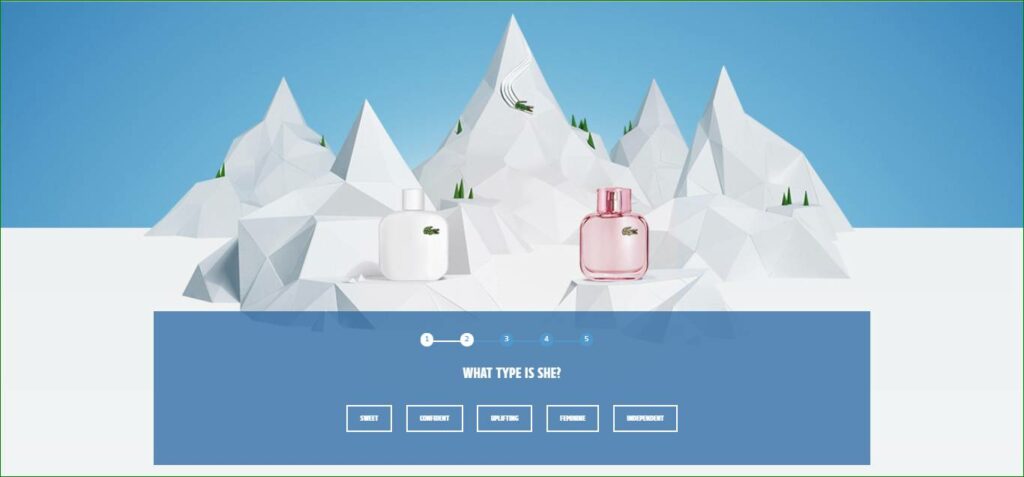
Source: Digitaland
Conclusion
Crafting unique and compelling landing pages has never been this easy. With all the tools and data at your disposal, you don’t need to reinvent the wheel. Apply the tips above and start leveling up your marketing efforts in time for the holiday season.