

A strong visual asset does more than look good. It guides the eye, supports a clear message, and gives people the confidence to take the next step.
The right graphic design strategies start with purpose. Before any design takes shape, the goal has to be clear. Is the asset meant to drive clicks? Explain a service? Back a campaign? Strengthen a product page? Each answer shapes the layout, colors, type, spacing, and visual direction.
The right design process makes each asset feel intentional, not rushed. In this blog, we dive into the design principles our graphic designers consider to create impactful visuals.
Graphic Design Secrets: How We Create High-Impact Visuals
Strong visuals are built on purpose, not guesswork. Our outsourced graphic designers in the Philippines consider these design principles to help each asset guide attention, build trust, and support action.
Color Psychology
Color sets the first impression. It can make a design feel calm, bold, premium, friendly, urgent, or trustworthy.
Our design team chooses colors based on the brand, message, audience response, and existing branding elements. A soft blue may help create trust. A bright accent color may draw attention to a button. A warm palette may make a brand feel more approachable.
Good color choices also help separate key information from supporting details while keeping the asset aligned with the brand. When used well, color makes the design easier to understand at a glance.
Visual Hierarchy
Visual hierarchy controls what people notice first, second, and third. Without it, the viewer has to work too hard to understand the message.
Designers create hierarchy through size, weight, contrast, position, and spacing. A headline may be larger and bolder. A call-to-action button may use a stronger color. Supporting text may stay smaller so it does not compete with the main message.
This makes the asset easier to scan. It also helps people move through the content in the right order.
Negative Space
Negative space is the empty space around design elements. It is not wasted space. It gives the design room to breathe.
Crowded visuals can feel stressful and hard to follow. Clean spacing makes the message look more confident and professional. It also helps important elements stand out.
Our team uses negative space to create focus. When there is less clutter, the viewer can understand the message faster.
Proportion
For example, a small icon beside a large headline can work well if the icon supports the message. A large image beside a short line of copy can create impact. But if one element is too large or too small for no clear reason, the design starts to feel off.
The use of good proportions makes visual assets look sharp. It also helps direct attention without making the layout feel contrived.
Iconography
Icons help explain ideas quickly. They are useful for service pages, feature lists, infographics, process sections, and social media assets.
The best icons are simple, clear, and consistent. They should match the brand style and support the message. If icons are too detailed or mixed in style, they can make a design look messy.
Our team uses iconography to make information easier to scan. This is especially helpful when explaining services, steps, benefits, or technical details.
Typography
Typography is the way the letters are arranged and spaced. It affects readability and brand personality. Good typography makes the message easier to read and more pleasant to follow.
Designers consider font style, size, spacing, weight, and line height to make a design feel refined, modern, playful, or serious. They also check how the type looks on desktop and mobile screens for readability.
Strong typography also improves trust. If the text looks careless or hard to read, the whole design can feel less reliable.
Repetition
Repetition creates consistency. It helps connect different parts of a design and makes the brand easier to recognize.
Designers repeat colors, shapes, button styles, icons, font treatments, and spacing patterns. This gives visual assets a clear system.
Repetition is especially important for brands that need many assets over time. Our team of experienced graphic designers in the Philippines use a consistent design system to help every visual feel connected, even when the format changes.
Proximity
Proximity means placing related elements close together. It helps people understand which pieces of information belong together.
For example, a heading should sit near the paragraph it introduces. A product image should stay close to its price or call to action. A testimonial should keep the quote, name, and role grouped together.
Good proximity makes the layout easier to understand. It also reduces confusion and improves the flow of the asset.
Accessibility
Accessible design is an important factor in business graphic design. It helps more people understand and use the visual.
Designers check color contrast, text size, spacing, button clarity, and readability. They avoid placing important text on busy backgrounds. They also make sure the design does not rely on color alone to explain meaning.
Accessibility is not just a technical concern. It is part of good communication. When a design is clear, it works better for everyone — regardless of device, ability, or context.
Building Visuals That Work as Hard as the Message
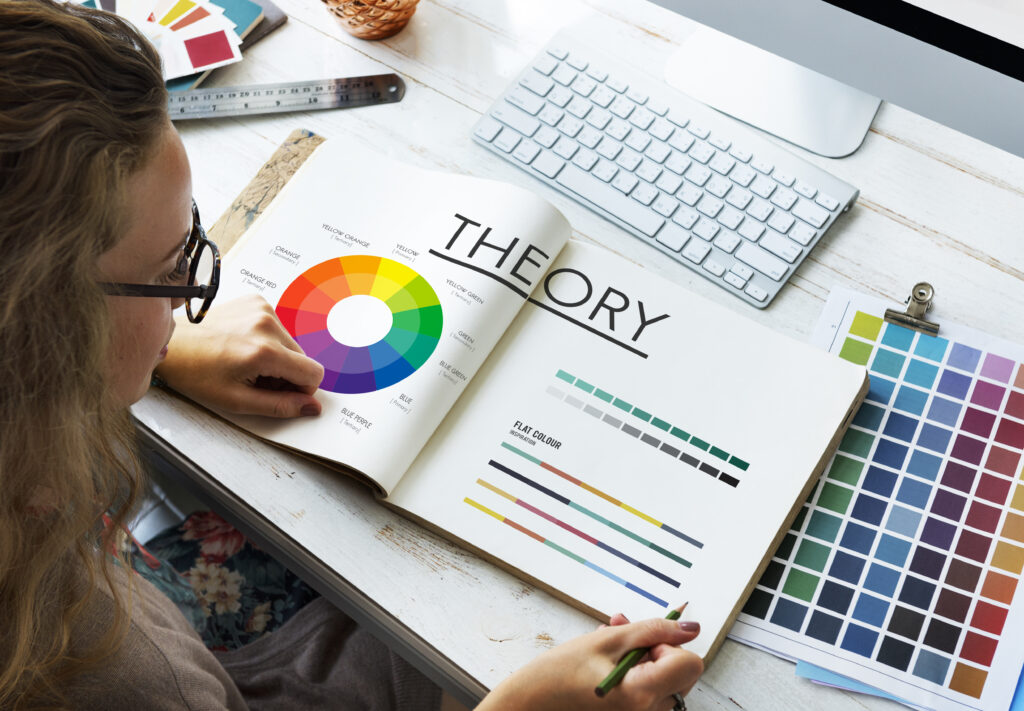
High-impact visual assets come from thoughtful decisions. Color creates mood. Hierarchy guides attention. Typography improves readability. Spacing builds focus. Repetition strengthens the brand. Accessibility makes the message easier for more people to understand.
At Webmastered, every design choice has a job. Our team creates visuals that look professional, feel aligned with the brand, and support real business goals.
Choosing the right graphic designer company helps turn ideas into assets that are clear, consistent, and conversion-driven. When you hire experienced graphic designers, the process becomes more than a creative task. It becomes a practical way to build trust and move people toward action.